We’ve always believed in the power of data, and know the importance of being able to measure ROI and understand how your one-to-one and one-to-many experiences are driving value. With JRNI Analytics, you are able to measure and improve upon the success of your experiential relationship management (XRM) strategy, and report to stakeholders with ease through dashboards, custom reporting tools, and notifications. JRNI Analytics allows you to measure everything from lead times and staff capacity to cancelation rate and conversion rate, as well as gives you a way to compare data over time - ensuring you can use your data to drive business decisions and deliver better experiences.
Today, we’re going to walk through four ways you can get started with JRNI Analytics to help set your team up for success!
1. Take advantage of the template library
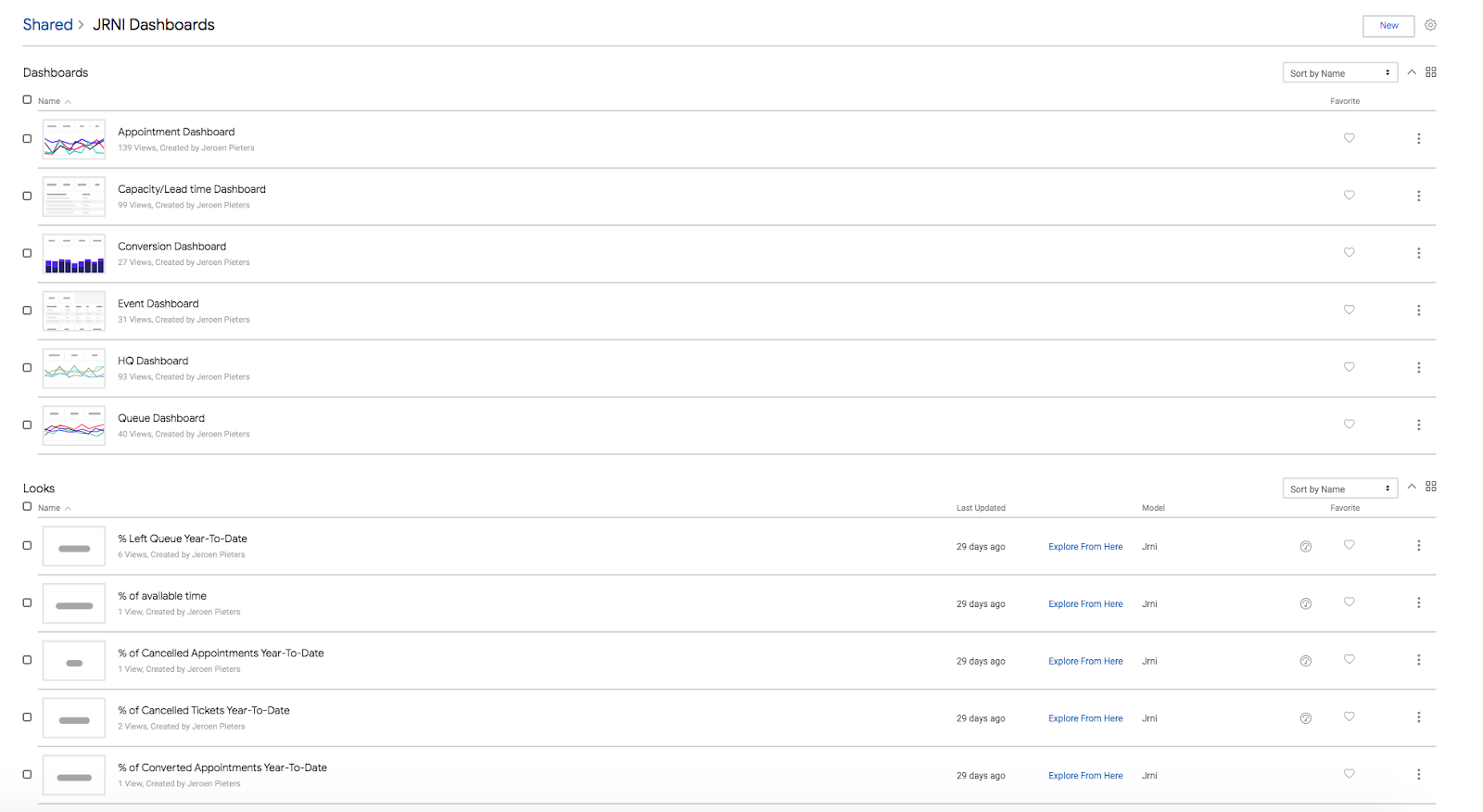
Your team will have access to six dashboards and 80+ charts out of the box that you can immediately start using. These templates allow you to start measuring the success of your experiences right away! You will have access to all six dashboards including:
- HQ Dashboard: overall overview and comparison over longer periods of time (Events, Appointments, Queueing)
- Appointment Dashboard: daily/weekly insights into appointments
- Event Dashboard: daily/weekly insights into events
- Queue Dashboard: daily/weekly insights into queue bookings
- Capacity / Lead time Dashboard: capacity of the staff and how long it takes for a customer to book a service in advance
- Conversion Dashboard: conversion of appointments and value
The HQ Dashboard is a summary of all of your locations in the JRNI platform. This gives you an overall overview and comparison over longer periods of time. You can drill down into more detailed data with a single click, as well as click on predefined data points such as month view, quarter view, and more. The Appointments Dashboard is an overview of your appointment bookings. You can quickly apply filters to see data at the store or branch level. Imagine being able to see how each physical location is performing in total - by region, by week, in comparison to others. The Capacity / Lead time Dashboard shows you the capacity of your staff, as well as how long it takes for a customer to book a service in advance. These are important metrics to follow to ensure an ideal customer experience! The Conversion Dashboard shows you the conversion of your appointments, giving you true insight into how impactful your appointments are on your bottom line.
After reviewing these dashboards, you can favorite your most-used dashboards, so you can easily return to them when needed. Additionally, you can check to see which dashboards are most relied upon among your users. Once you get started with a couple of the pre-set templates, we encourage you to spend time with your teams to determine which dashboards and charts you’d like to keep track of as an organization to ensure everyone is on the same page.
2. Schedule reports for distribution to appropriate teams
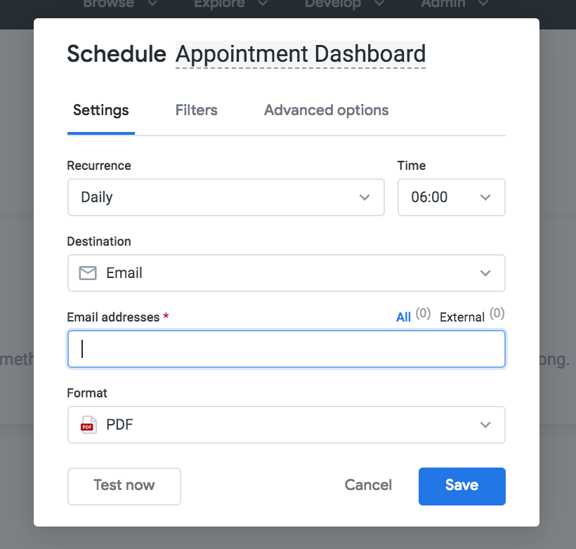
Look, we get that not everyone is a data scientist or has hours upon hours to dive into layers of data. We know you’re busy running your organization from A to Z, and you likely don’t have the time to customize or run reports. That’s why we made reporting on your experiences EASY. There is no need to fuss with complicated reports or to struggle finding the right information, simply schedule a report to send to your inbox. You can also easily schedule reports to be sent out to key stakeholders. When scheduling the report to go out, you can include a custom message, choose the data format, and select how often you receive the reports. By having reports automatically sent to your inbox, you and your teams will have a convenient and simple way to keep track of success and continuously improve upon your experiences.
This is a great way to make sure you never miss an important piece of information, and is super simple to set up. Check out this video from our Global Customer Success Manager, Hannah MacGregor to see just how simple it is!
3. Create custom reports
Speaking of data analysts… if you are one, or you do want to create custom reports and dashboards, guess what? You can! JRNI Analytics gives you and your team access to JRNI’s predefined data schema so you can create the customized reports and dashboard content that is going to help you evaluate success. With so many established dashboard templates, this is certainly not necessary to measure success or track ROI, but gives your team the option to have full control over how you manage your data.
4. Set up KPIs and notifications
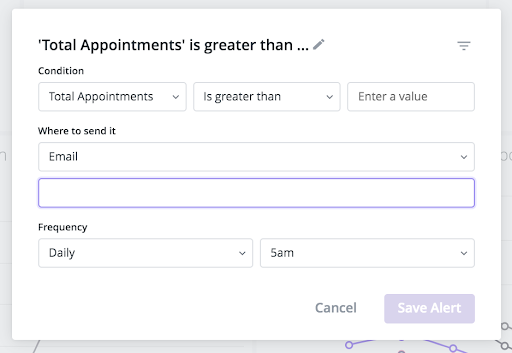
Every organization is different, which is why we cannot stress enough the importance of setting up your own key performance indicators (KPIs). JRNI Analytics allows you to not only set up your custom KPIs, but also allows you to enable alerts anytime one of your KPIs goes above or below what you’re expecting. This way you never miss an important event!
Using JRNI Analytics for KPIs and notifications provides an easy way to keep track of success, progress, and any issues that might require immediate attention. By having well-defined KPIs and automatic alerts sent to team members, you can be sure the right team members are in the know! This will translate to even more success for your team, as you’ll be able to make better, more informed decisions about your business to meet and exceed goals.
So there you go - these four tips will help you start measuring your success right away! If you’re a customer looking for more information on JRNI Analytics, be sure to reach out to your Customer Success Manager.
Not a customer yet? Well, we’re excited you’re here, and it’s nice to meet you! We would love to show you our experiential relationship management (XRM) platform and how JRNI can work for you.
Want to see JRNI Analytics in action? Then be sure to watch the demo! If you’re interested, you can also sign up to speak to one of our experts.